Ladies, you can all stop complaining about not being paid as much as men because Reddit has determined that there is no gender wage gap. Reddit user Rhiever posted in r/dataisbeautiful an article that proves the gender wage gap doesn’t exist, writing “When you compare salaries for men and women who are similarly qualified and working the same job, no major gender wage gap exists.”
Clicking the link in his Reddit post probably goes to some super scientific study, right? I mean, rhiever seems so sure of himself that he must have some very good data to back up his claims. In fact, clicking the link takes you to an infographic by for-profit wage comparison company PayScale.com. That’s right, the same PayScale that wrote a terrible fake “study” two years ago that I mocked right here on Skepchick twice. Perhaps they learned from my takedown of their previous study and actually used a scientific methodology this time around.
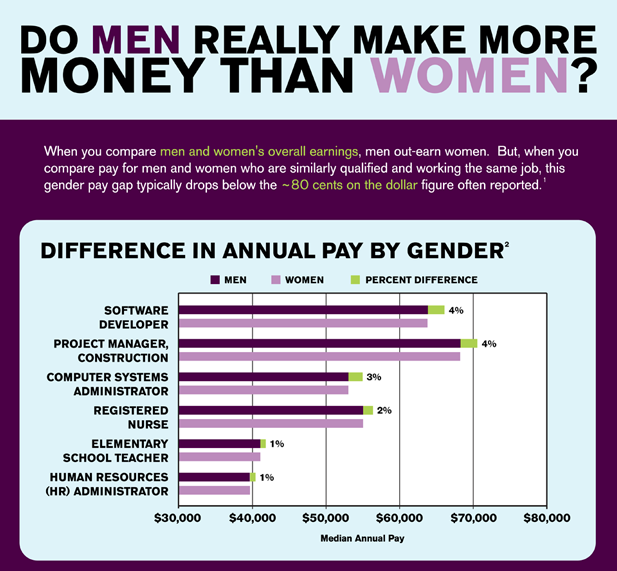
According to this first part of the PayScale infographic, if you compare men and women that are similarly qualified and in the exact same jobs, the pay gap is smaller than the 80 cents on a dollar that the evil feminists claim. Of course, no one is claiming that the “80 cents per dollar” number comes from comparing women and men of the same qualifications and job titles. It’s supposed to show the structural sexism that exists in society that puts women at a disadvantage in hiring, promotions and salary, not to mention discourages them from even entering high-paid fields. Even if women were getting paid equal to men in the same exact jobs, women are still at a disadvantage if they have a harder time getting those jobs or aren’t able to get promoted as often as their male counterparts. Plus, the PayScale chart still shows men making more than women in the six positions they chose to feature to prove that men make the same amount as women. I’m honestly confused as to how this chart is supposed to prove that men and women in the same jobs make the same amount of money when they apparently couldn’t come up with one job title where men and women are paid the same.
I also have to question why they chose these six positions out of all the possible jobs in the world. Were these the positions with the most people in them so the data is closest to accurate? Were they chosen randomly? Did these positions best represent the full job dataset? Or, did PayScale specifically choose these six positions because they had the smallest wage gap and proved their point better than all the other jobs?

Oh good, PayScale is going to give us reasons why the wage gap doesn’t really exist. The first explanation they provide is job choice. Women just choose jobs that pay less because women don’t like money or something. Right? Or, err… there has to be a better reason than that. I wonder why women would possibly not want jobs that make more money, unless there is something discouraging them from the higher-paid jobs. You know, possibly something “structural” that disadvantages women.
The second reason PayScale gives for women making less money than men is that college-educated women have children at age 30. Of course, only 30% of people in the United States actually get a bachelor’s degree or higher. I’m not sure what the other 70% of women’s excuse is. Also, having children only effects women because men don’t have children, leaving them free to take all the money from the money-hating mothers.
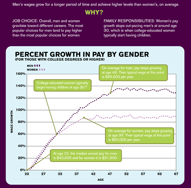
Can we just take a second to admire that wonderful chart? There are so many glorious things happening on that chart that it’s hard to know where to begin. Let’s start with the y-axis. When I first saw this chart, I thought the y-axis was median or average income, but in fact it’s labeled as “wage growth.” Then I got even more confused because wages seem to be growing exponentially, meaning WE ARE ALL RICH! 32 year old women have 60% wage growth! I’m 32 next year so I assume I can look forward to a 60% raise. Someone tell my employer!
But alas, the y-Axis is clearly not showing yearly growth. Instead, it’s showing growth over the median pay by gender at age 22. In other words, it’s essentially just showing income on the y-axis labeled in a different fashion. Of course, if they actually showed income rather than “growth” their male and female lines between ages 22 to 32 would no longer be on top of each other because the women are starting out with a baseline $8900 lower than the average man. That’s right. At age 22 women make only 78 cents for ever $1 earned by a man according to the chart. In order to hide this on their chart, PayScale normalizes each gender by their baseline at age 22 then shows their higher income in the future as the percent gained from that baseline. Since they show the growth in percent of the baseline, it also means that women’s income in real dollars is growing less than for men. At age 30 it shows that both men and women have had a wage growth of 60%. That means that men’s income rose from $40,800 at age 22 to $65,280 at age 30 and women’s income rose from $31,900 at age 22 to $51,040. The gender wage gap also increased during these eight years from $8900 at age 22 to $14,240 at age 30. At age 30 women are still only making 78 cents for every man’s dollar.
After age 30, according to the PayScale chart, women’s income growth slows while men’s continues to rise. According to PayScale all the ladies started having babies the second they reached 30, explaining the entire gap. Women’s income tops out at age 39 at $60,000 per year. Men’s income continues to rise until they hit $95,000 per year at age 48. Wait a second… the median man is making $95k in income by age 39?? Really? Somehow I’m not quite sure I really trust this data.
Even if we assume their underlying data is correct, they are claiming that at age 48 men are making $95k per year while women are stuck at $60k per year. That’s now 63 cents that a women makes per every dollar that goes to a man. I’m starting to wonder if we can really chalk this up to all women having children at age 30. More likely, women are able to do well and get promoted in their careers up to a certain point, but the higher they get the less likely they are to be promoted, which causes their income growth to stagnate. Companies tend to have less and less women the higher you get in the company, which would lead to men continuing to see wage growth while women’s income stays steady in the second half of their career.
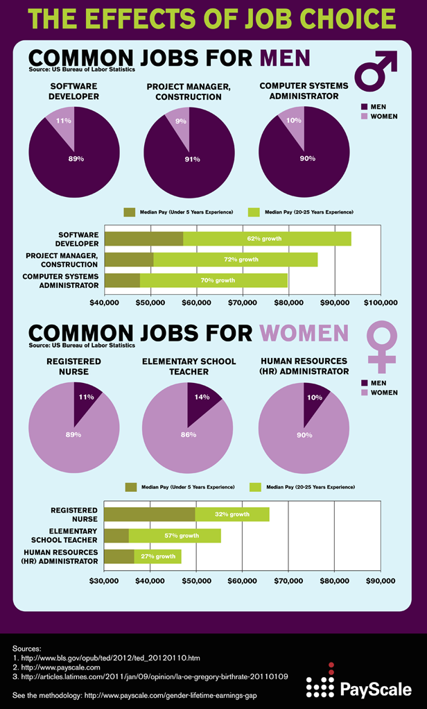
This part of the chart is just showing that men have higher paid jobs than women. They call it “job choice,” because again, women “choose” lower paid jobs. The fact that jobs in software development, construction, and computer systems may have atmospheres toxic to women isn’t the fault of the job. If women really wanted all the money they would just “choose” it. It’s that simple. My absolute favorite part of this last infographic section though is the “Sources” if only because they list “payscale.com” as a “source.”
Now, I’ve been really hard of PayScale for this infographic, but unlike most infographics they included a methodology! I’m sure their methodology will answer all the confusion and questions I had when reading their infographic. This section probably explains how they determined that jobs and experience were similar in order to control for those aspects when comparing men and women with the same jobs and qualifications. PayScale wrote the following:
To compare male and female pay on a level playing field, we found the median pay for all men in a given job, as well as breakdowns of important compensable factors such as years of experience, location, education level, etc. Then, using PayScale’s proprietary MarketMatch™ Algorithm, we determined what the female median pay would be using the exact same blend of compensable factors as our control male group.
Wait…that’s it? The way PayScale controlled for job type and experience was [REDACTED]. Sorry PayScale, but you can’t call this section “methodology” and then just announce PROPRIETARY ALGORITHM and leave it at that. You can’t show us your actual methodology because it’s SOOPER SECRET, but we should just trust you that it’s good?
I’m calling bullshit on this entire exercise. PayScale, just stop. Stop coming out with “WE PROVED THE GENDER WAGE GAP DOESN’T EXIST” articles every single damn year. And Reddit, stop using terrible infographics from for-profit websites with questionable data as proof that feminists are evil lying liars.